 A triangular plot is able to show three different variables, of course in the shape of a triangle. This particular triangular plot shows the estimated fraction of the population intending to vote for each of the major parties. The white part being the current estimate of opinion polls. The colored parts of this triangular plot show the regions of the plot which each of the corresponding major parties would win over majority in parliment. http://www.ex-parrot.com/~chris/wwwitter/20050407-it_doesnt_matter_how_you_vote_either_way_your_planet_is_doomed.html
Monday, April 18, 2011
Triangular Plot
A triangular plot is able to show three different variables, of course in the shape of a triangle. This particular triangular plot shows the estimated fraction of the population intending to vote for each of the major parties. The white part being the current estimate of opinion polls. The colored parts of this triangular plot show the regions of the plot which each of the corresponding major parties would win over majority in parliment. http://www.ex-parrot.com/~chris/wwwitter/20050407-it_doesnt_matter_how_you_vote_either_way_your_planet_is_doomed.html

Windrose

A windrose is a tool used by meterologists to give a succinct view of how wind speed and direction are distributed in a particular area. This specific windrose is a distribution wind rose plot for air temperature. This type of wind rose allows you to view the distribution of a second variable in connection to wind direction. This windrose allows us to see that the strongest speed and direction is going toward the east and south east.
http://www.vistadatavision.com/reports-2/wind-rose/Climograph

A climograph is a representation of climate parameters, this being mothly average temperature and precipitation. This climpgraph shows these averages of Boulder Colorado. The april showers brought the most precipitation in the months of april and may, then the heat of the summer raised the temperature to be highest in July and August. The precipitation being over 3 inches and the heat rising over 70 degrees.
http://www.colorado.edu/geography/extra/geogweb/bouldercreek-2/preview/page2.htmlFriday, April 15, 2011
Population Profile
 A population profile is exacly what it says in a name, it shows population within a given area. This specific population profile is representing imigrants within the U.S. within 2004. The most popular age of immigrants for both males and females are in the thirties and the least popular for both male and females is age 75 and older. I can understand the age of popularity in immigration being in the thirties because this is when many people choose to come over, find a job and try to raise a family over here.
 Scatter Plot

Scatter plots are a great representation of how one variable effects another, the relationship between these two variables is called a correlation. We can see within this scatter plot that the variables being compared are the amount of income one makes compared to their years of experience in that field. Judging from this graph you can tell that the more years experience they have the higher their payment is.
http://allpsych.com/researchmethods/correlation.htmlWednesday, April 13, 2011
Index value plot

An index value plot can be used as another type of visualization map. It is used on an index value and is then plotted into a line graph as shown. This index plot shows the average stream flow index of New Mexico between the years of 1999 to 2008. In this example you can see the line passing through the middle at four, this is the flow value that was set. Above that line means that New Mexico had been too wet and below four meant that new Mexico was too dry.
Accumulative Graph or Lorenz Curve
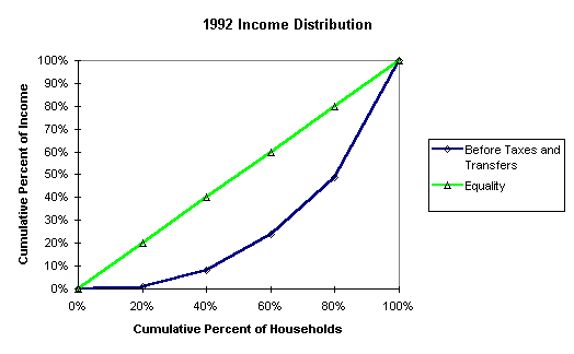
An accumulative graph or Lorenz curve could really also be called a probability curve. This graph here shows the probability of the 1992 income distribution. The green line is representing the equality and the blue curve represents the amount before taxes and transfers. This graph is helping to show the percentage of wealth within the population.
Subscribe to:
Posts (Atom)