 A Digital Line Graph is a digital vector data representing cartographic information depicting a wide varity of geographic features. This DLG is a representation of the San Francisco creek. The data here is stored as lines and points in order to depict the creek itself.
 Monday, April 18, 2011
DLG Map
A Digital Line Graph is a digital vector data representing cartographic information depicting a wide varity of geographic features. This DLG is a representation of the San Francisco creek. The data here is stored as lines and points in order to depict the creek itself. Star Plot
 A star plot is a graphical methodof displaying mulitivariate data in the form of a two dimensional chart. This is an example of a star plot from NASA within the center there are some of the most disierable disign results. This is a star plot of MER IDD which is represented by the red line within the center.
 Correlation Matrix
 A correlation matrix is a matrix that is capable of making connections between all pairs of data sets. This specific correlation matrix shows the correlation between the cluster moments for electrons and pions. The red line down the center reading 100's shows the greatest correlation.
 Similarity Matrix
 A similarity matrix expresses the similarity between two data points. This similarity matrix is for a collection of ten bacterial strains. These strains have been ordered so that we are able to see which ones most clearly resemble one another in their overall phenotype. We can see that strains 6 and 3 match each others phenotype 100 percent. And the lowest percentage of resemblance can be seen between 3 and 5, 3 and 9, as well as 3 and10. http://www.jbaas.com/HTML/Previous%20Issues/Volume%20No.%202%20No.%202/Headings/H-7.html
Stem and Leaf Plot
 A stem and leaf plot is another graphic or numerical displayof the distribution of a variable. The information is tabulated so that the last digit is the leaf and the rest of the numbers in front are the stem. This example of a stem and leaf plot shows the ages of people at a family reunion. This plot shows that the oldest person at the reunion was 81, and the youngest was just one year old.
 Box Plot

A box plot can also be known as a box and whisker plot or diagram. It is an easy way to graphically depict groups of numerical data through their 5 number summaries. In this box plot we can see the upper quartile reads about 125, the median reads about 78, and the lower quartile reads about 30. These numbers are the annual snow depth of mathsville ski resort.
Histogram

A histogram is a diagram consisting of individual bars who's area is proportional to the frequency of a variable and whose width is equal to the class interval.
This is a graph of a strike histogram. The strike histogram show the range and variability of slope strike within a grid model. This corresponds to the directions of ridges and valley's
http://www.rockware.com/rockworks/revisions/2005_q2.htmParallel Coordinate Graph

Parallel coordinate graphs show a series of values and show numerous amounts of data. These types of graphs show many types of variables and they are displayed each on their own individual axis. These axis' are all vertical and have the ability to connect all of the different variables across the entire graph.
Triangular Plot
 A triangular plot is able to show three different variables, of course in the shape of a triangle. This particular triangular plot shows the estimated fraction of the population intending to vote for each of the major parties. The white part being the current estimate of opinion polls. The colored parts of this triangular plot show the regions of the plot which each of the corresponding major parties would win over majority in parliment. http://www.ex-parrot.com/~chris/wwwitter/20050407-it_doesnt_matter_how_you_vote_either_way_your_planet_is_doomed.html
Windrose

A windrose is a tool used by meterologists to give a succinct view of how wind speed and direction are distributed in a particular area. This specific windrose is a distribution wind rose plot for air temperature. This type of wind rose allows you to view the distribution of a second variable in connection to wind direction. This windrose allows us to see that the strongest speed and direction is going toward the east and south east.
http://www.vistadatavision.com/reports-2/wind-rose/Climograph

A climograph is a representation of climate parameters, this being mothly average temperature and precipitation. This climpgraph shows these averages of Boulder Colorado. The april showers brought the most precipitation in the months of april and may, then the heat of the summer raised the temperature to be highest in July and August. The precipitation being over 3 inches and the heat rising over 70 degrees.
http://www.colorado.edu/geography/extra/geogweb/bouldercreek-2/preview/page2.htmlFriday, April 15, 2011
Population Profile
 A population profile is exacly what it says in a name, it shows population within a given area. This specific population profile is representing imigrants within the U.S. within 2004. The most popular age of immigrants for both males and females are in the thirties and the least popular for both male and females is age 75 and older. I can understand the age of popularity in immigration being in the thirties because this is when many people choose to come over, find a job and try to raise a family over here.
 Scatter Plot

Scatter plots are a great representation of how one variable effects another, the relationship between these two variables is called a correlation. We can see within this scatter plot that the variables being compared are the amount of income one makes compared to their years of experience in that field. Judging from this graph you can tell that the more years experience they have the higher their payment is.
http://allpsych.com/researchmethods/correlation.htmlWednesday, April 13, 2011
Index value plot

An index value plot can be used as another type of visualization map. It is used on an index value and is then plotted into a line graph as shown. This index plot shows the average stream flow index of New Mexico between the years of 1999 to 2008. In this example you can see the line passing through the middle at four, this is the flow value that was set. Above that line means that New Mexico had been too wet and below four meant that new Mexico was too dry.
Accumulative Graph or Lorenz Curve
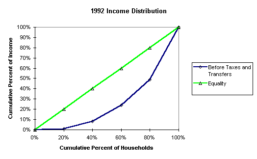
An accumulative graph or Lorenz curve could really also be called a probability curve. This graph here shows the probability of the 1992 income distribution. The green line is representing the equality and the blue curve represents the amount before taxes and transfers. This graph is helping to show the percentage of wealth within the population.
Bilateral Graph

A bilateral graph is one in which there are two variables being measured and graphed as well as where these two variables over lap. This graph shows adults who had implants put either into one ear (right or left) or both ears; and who was able to hear better e,6, and 8 months later. It is shown clearly in this graph that adults who had the implants put into both of their ears were hearing on much higher levels than those who only received one.
http://www.advancedbionics.com/cms/your-journey-to-hearing/bilateral-research.aspxNominal Area Choropleth Map
 A nominal area choropleth map displays data with ungraded color patterns which helps the reader with recognition of areas of interest. For example race a good topic to be shown within a nominal area choropleth map. The race being used within this map is the Latino and/or Hispanic race and it is broken down by county within the 2009 census. South Florida near Miami has the highest percentage of Latino/Hispanics, which I believe is to be known as Dade county.
 Unstandardized Choropleth Map

Unlike a standardized choropleth map in this unstandardized choropleth we can see it is not averaged by any sort of percentages or measurements. By this map we are able to see the total fertility rates of the entire world between the years of 2000 to 2005. Of all of the seven continents (six being shown) we are able to see that Africa is the most fertile of all.
http://www.eps.mq.edu.au/courses/GEOS219/choropleth.htmStandardized Choropleth Map

This standardized choropleth map shows the percent of the Canadian population under the age of 14 in the 2006 census. Standardized choropleth maps are areally averaged and just as this map they can be presented in many different ways. They allow comparison of distribution amoungst areas as well.
http://www.statcan.gc.ca/pub/92f0138m/2008003/figures/5200001-eng.htm
Univariate Choropleth Map

This picture of a Univariate Choropleth map shows the harvested acres of corn for grain in 2002. We can see that many areas in the north have between 100,000-149,000 acres and with some areas having over 150,000 acres. This would be considered to be a univariate choropleth map because it is a single data set displayed over one given areas.
Monday, April 11, 2011
Bivariate Choropleth Map

A Bivariate Choropleth Map uses color to solve a problem of representation in four dimensions. This bivariate choropleth map offers several sequential and diverging color schemes, automatic or manual classification as well as a scatter plot so that we can view the relationship between attributes.
Unclassed Choropleth Map

The unclassed choropleth map is the technique that assigns shading proportional to the data values so that these choropleth mapsto not have to classify data. Cartographers claim that with this method they lose the ability to direct the message of communication. There are five classes used on on an equal bin interval classification scheme.
Classed Choropleth Map

A classed choropleth map is a map that represents data by the coloring or shading of data. This map from 1992 represents the beef cattle emissions in North Carolina. The middle and northern part of the state have the highest number of emissions with the east coast having the least.
Range Graded Proportional Circle Map

A range graded proportional circle map depicts the circles in relation to ranges of data. In this map the area of the circle is proportional to the channel width, and the color of the large circle approximates the color of the water.
Continuously variable proportional circle map

A continuously variable proportional circle map uses circles in order to create point data. The circles being used are in proportion to the data that is measured. For example, this graph represent the amount of people killed in road accidents in Europe in the year 2000. Italy is within a few of the largest circle's meaning that they are included in some of the highest numbers of people killed in road accidents.
DOQQ

A DOQQ is a remote sensing digital map that is computer generated using aerial photographs. The red shade of the DOQQ in comparison to an aerial view can be changed if needed to make certain distinctions stand out.
DEM

This Digital Elevation Model is showing the Oak Ridges Moraine. This ridge separates Lake Ontario from Lake Simooe. Oak ridges moraine is 160 km long of sand, silt and gravel deposits that is oriented approximately east-west and lies north of Lake Ontario.
Isopleth Map

An isopleth map is able to generalize and simplify data with a continuous distribution. This given map is of Mexico and it is using lines to show the connecting places of equal distribution of temperatures. This isopleth map is also showing political boundaries, major cities, the country's capital city, major rivers, and lakes.
DRG Map

This Digital Raster Graphic (DRG) Map is being used as a back drop for other digital data. For example this map in perticular the lakes, rivers and streams are able to be checked for completeness by putting it over a DRG.
Isopach Map

An isopach represents the variation of thickness within a tubular unit. This isopach map represents a picture of a gas field. It shows the thickness of the sandstone in which they go through in order to get to the oil. The hottest and thickest levels are in the center pink areas at 45 feet and thins out to 20 feet in the blue areas. http://www.cartage.org.lb/en/themes/Sciences/Earthscience/Geology/OilandGas/HydrocarbonExploration/GeologicMaps/GeologicMaps.htm
Isohyet Map

An Isohyet map represents precipitation levels within a specific areas, in this particular map we can see the precipitation level in the state of California in 1998. You can see that more brown and yellow colors indicate less precipitation. The southern part of the state is much dryer than the north and within the entire state the highest level of precipitation is only 84-96 inches within the entire year.
Isotach

Given a certain area, a isotach map shows winds speeds within that area. The distance of the lines between one another depicts the speed of the winds. The closer the lines are together the faster the wind speeds are. For example, within this map you can see the lines toward the north of the map are much closer together than those in the south, this in other words indicating higher wind speeds in the north.
Isobars

An Isobar map is the joining of points at an equal atmospheric pressure measured in millibars. These lines do not touch one another and vary each day due to the earth's rotation. You can see in the map where is says H and L this represents the highs and lows of the pressures within the map.
LIDAR

This LIDAR map represents a three dimensional view of lidar-based topography in 2007 as well as on September 8th 2008 if you click on the link to see it change. The blue areas represent elevations below mean high water; lower elevations are shown by brown and higher levels are represented by greens and reds. A LIDAR system works on the basis of radar and this is also displayed within this map.
Doppler Radar
 It is interesting to do some research on doppler radar because there is more too it than we see on our everyday weather channels. This photo of a doppler radar shows storms moving east across the Tennessee Valley in May of 2008. Doppler radar is used to to display objects moving at a distance in order to show what is moving in a certain direction, this helps to warn those within that certain area. http://www.al.com/news/huntsville/index.ssf/2008/05/04-week/
Black and White Aerial Photo

Black and white aerial photo's are very similar to that of infrared but are meant to show more specific surface features. Within a black and white photo the details are really able to pop out, more so than with color and through this photo of this city you can really get a sense of that. You can see specific deatil of road ways, houses and land ownership.
Infrared Aerial Photo

This color infrared aerial photo is of a portion of Willapa Bay in Washington. The green portions are showing a vegetation layer with the red outlines representing oyster agtriculture areas. This infrared aerial photograph gives the ability to show the effects of aquaculture and pest control strategies. http://www.ars.usda.gov/is/AR/archive/may08/oyster0508.htm
Sunday, April 10, 2011
Cartographic Animation Map

This map explains seasonal temperature variations in terms of latitudinal and seasonal variations within the surface energy balance. The reason these are called animation maps is because when they are in motion they are able to tell certain things such as types of weather patterns. This map is able to show seasonal weather patterns throughout different times of the year.
Statistical Map

The main point of a statistical map is to explain exactly that...STATISTICS! Within this very map you are able to see the statistics of adult obesity within each state of the U.S. in a three year average from 2007-2009. It shows the state with the lowest obesity rate being Colorado at 16.9% and the state with the highest obesity rate being Mississippi at 29.5%. The correspondance of the percentages are slightly different from this map to the one within the posted url, I am not exactly sure as to why but I am sorry for any confusion.
Cartogram
 This is a cartogram representing the global population, the relative size corresponds with relative population respectfully, by people living within each country. Judging by this map you can see the Japan and China are given more surface area than they actually have in real life. But when taking into consideration that this map is about population size it then make sense the portion size of each of these countries; especialyl in comparison to north and south america. http://www.infovis.net/printMag.php?num=197&lang=2
Flow Map
 Within this flow map we can clearly see that this is a representation of the flow of different freight train routes. This specific train route goes all over the United States including some part of almost every siate. We know that this is a flow map because it is showing that there is movement of some sort of object from one place to another. http://www.texastrimodal.com/11.html
Tuesday, April 5, 2011
Isoline Map

This picture is of an isoline map because it is showing continuous lines which join points of the same value. A weather map like this can be used to represent different altitudes, wind speeds, and temperatures. This perticular map is showing barometric pressures within the US.
Proportional Circle Map

A Proportional Circle map judges number amounts based on the "proportion" of the circle within the area. For example within this map the larger the blue dot the more walmart's there are within that specific state. Judging by this map the most amount of wamarts are in texas with over one hundred and the least amount of walmarts is in vermont with about five.
Choropleth Map

This here is a picture of a choropleth map because it not only using different color depictions but it also gives information within each area saying which state is which. Using certain indicators such as these is proof of a choropleth map. Another way to describe an choropleth map is by saying it is based on predefined areial units. You can observe from this picture the states that chose to vote for either George Bush or John Kerry in their election
Dot Distribution Map

A dot distribution map is used to show populations within a certain given area.
This picture of a dot distribution map shows the population of each state in both 1990 and 1996. The blue half of the dots are representing the 1990 population and the red half is representing the 1996 population. It is clear that the larger the dot the greater the population within that state as well. California, Texas, and Florida are showig the biggest dots and this corresponds well with the amount of people these states have. As well as with the smaller states such as Rhode Island, New Hampshire, and Vermont, their dots are smaller than everyone elses. http://hosting.soonet.ca/eliris/remotesensing/bl130lec7.htmlPropaganda Map

This here is clearly a propaganda map! It is showing the world how Ronald Regan would choose to view it. With the USA obviously being the biggest and most powerful. With nothing good to say about the countries in the middle east, and making California the biggest country within the US. A propaganda map is basically a lying map. It shows what the cartographer chooses to show, with their opinions and their ideas. This is definitely not a factual map nor will it ever be.
Hypsometric Map

This picture here is showing a Hypsometric map of the Isera Mountains. This is a hypsometric map because it clearly shows the relief by the countrouring lines, shading and tinting. Also is also a hypsometric map because these maps usually use a shading from green through yellow to brown just as it is shown here within this map. The blue line is showing the outline of the Izera Dark-Sky Park. And with the white line representing the Czech-Polish border there are bound to be segregation issues within this park.
PLSS Map

A PLSS Map is that included in the Public Land Survey System. Within the US they use this asa a way of subdividing and describing land. Another name used by the US for PLSS are rectangular survey systems. This map makes it very clear to see the different numbered sections showing which land parts belong to which section. This PLSS map is nice because the cartographers made it easy to read as well as understand.
Thursday, March 31, 2011
Cadastral Map
 This is map shows distinct boundries and ownership between the land area therefore making it a cadastral map. A cadastral map like this one can sometimes provide a cartorgaphic record of official and sometimes private land surveys and subdivisions. http://www.dimensionicad.com/india/cad-parcel-mapping.html
Thematic Map

The color depictions given within this thematic map how the median ages in the year 2000 within each state. This is one of my favorite maps because they are very easy to read and also for a cartographers it is easy for your point to be made. This thematic map in perticualar is able to show census data in a graph formation. Even though you can only partially see it at the bottom of the map, Florida is the darkest green color indicating that we in 2000 had one of the highest populations on the east coast.
Subscribe to:
Posts (Atom)